Table of Contents
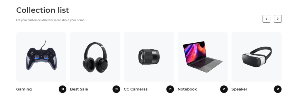
The appearance of the collection list #
Section title settings #
| Settings | Description |
| Heading | RichText: You can add a section title using the RichText editor. Learn more about this |
| Heading size | Large: This is the large text size of the section heading. Desktop size: 50px, Mobile Size: 30px Medium (Default): This is the medium text size of the section heading. Desktop size: 40px, Mobile Size: 28px Small: This is the medium text size of the section heading. Desktop size: 32px, Mobile Size: 25px |
| Subheading | This is the section subtitle. |
| Heading alignment | Left: Aligns the content to the left. Right: Aligns the content to the right. Center: Aligns the content to the center. |
Collection card #
| Settings | Description |
| Image ratio | The display ratio for the images that you add to your collections in the Products > Collections section of your Shopify admin: Adapt to image – Uses the aspect ratio of the images. This prevents the images from being cropped. Portrait – Crops the images to use a 2:3 ratio. Square – Crops the images to use a 1:1 ratio. Circle: Images are cropped to a 100% rounded. |
| Layout | Grid: If you select this, the collection will be displayed left to right with an equal size of columns. Slider (Default): If you select this, the collections will be activated on the slider mode. |
| Collection card | Collection style, 1. Standard. 2. Arrow icon show on the image. 3. Content show on the image. 4. Content inside with button. |
| Round the corners of the image | If you enable it, the collection image corners will be rounded. |
| Show product count | This is an option to show how many products are in a collection. |
| Enable “View all” button | if list includes more collections than shown |
| Number of columns on desktop | If you enable it, the collection image corners will be rounded. |
Slider settings #
If you enable the layout slide, the slider settings will be working fine
| Settings | Description |
| Auto-rotate slides | A slide show can be set to play automatically. |
| Change slides every | Determine how frequently to update slides. Minimum 1s and maximum 10s |
| Show navigation | You can hide/show slider navigation next/prev arrow button. You can go to the next/prev slide by clicking the next/prev buttons. |
| Color | Scheme color |
| Pagination style | Pagination style – Dots – Counter |
Collection block settings #
| Settings | Description |
| Collection | Select collection: You can display any collection for a specific collection card. |
| Image | You can add a collection image from the customizer. Optional! Instead of the collection’s image, the selected image will be displayed. |
Mobile settings #
| Settings | Description |
| Section title alignment | Left: Aligns the content to the left. Right: Aligns the content to the right. Center: Aligns the content to the center. |
| Number of columns on mobile | You can select a product column per row following the options (1, 2). Except for the collage layout, Works on all other layouts. |
Section padding settings #
| Settings | Description |
| Desktop: Padding top | The section’s top inner space height is determined. From 0 to 150 px, will be incremented by 5px. It will affect the desktop. |
| Desktop: Padding bottom | The section’s bottom inner space height is determined. From 0 to 150 px, will be incremented by 5px. It will affect the desktop. |
| Mobile: Padding top | The section’s top inner space height is determined. From 0 to 150 px, will be incremented by 5px. It will affect the mobile. |
| Mobile: Padding bottom | The section’s bottom inner space height is determined. From 0 to 150 px, will be incremented by 5px. It will affect the desktop. |