Table of Contents


General settings #
| Settings | Description |
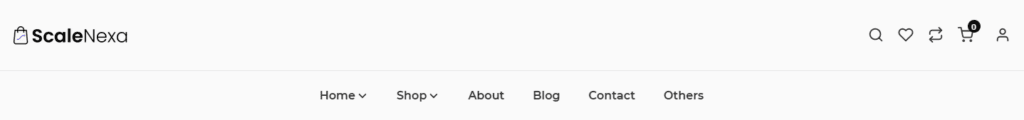
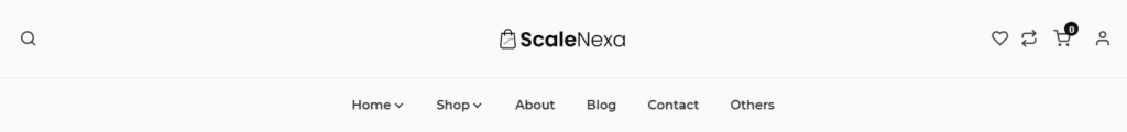
| Desktop logo position | When a customer views the site on a large screen, such as a desktop computer, the logo appears in the header. Middle left (Default): The logo is displayed inline with the main menu, centered vertically and to the left. Top left: The logo is displayed above the main menu, and the logo and menu items are aligned to the left. Top center: The logo is displayed above the main menu, and the logo and menu items are centered. And search button will be displayed to left Middle center, drawer menu: The logo is displayed in the center of the header; the menu can be revealed by sliding in from the left and hiding the page behind it. Middle center, split menu: The logo is displayed at the center of the header, with the menu items evenly distributed—50% on the left side and 50% on the right side of the logo, all aligned centrally. |
| Menu | This is the main menu for your store. |
| Menu alignment | Center: Aligns the menu item to the center. Left: Aligns the menu item to the left. Right: Aligns the menu item to the right. |
| Show cart icon | Displays the cart icon of the header. If you disable it, the cart icon will disappear from the header. Also, You cannot access the cart page or “mini-cart” page. |
| Show user icon | Displays the user/account icon of the header. If you disable it, the user icon will disappear from the header. Also, you cannot access the account page from the header. |
| Show wishlist icon | Displays the wishlist icon in the header. If you disable it, the icon will be removed from the header. |
| Select wishlist page | Choose the page where customers can view their saved wishlist items. |
| Show compare icon | Displays the compare icon in the header. If you disable it, the icon will be removed from the header. |
| Select wishlist page | Choose the page where customers can view their saved wishlist items. |
| Color scheme | You can change color of the header. |
| Page content width | Make section full width on desktop: Displays within the default container. When enabled, the section expands to the full width of the browser. (You can also adjust the default page layout width in “Theme Settings“) Full width offset: Applies an offset when full width is enabled, affecting devices larger than desktops. |
Search #
| Settings | Description |
| Show search icon | Displays the search icon of the header. If you disable it, the cart icon will disappear from the header. |
| Search appearance | Choose how the search function is displayed. Options include Search Popup, which opens a modal when clicked, and Search Box, which embeds the search field directly in the header. |
| Color scheme | Customize the colors of the search elements, including the background, text, and icons, to match your store’s design. |
Sticky header #
| Settings | Description |
| Enable sticky header | When the customer scrolls down the screen, the header is re-displayed. When the customer stays at the top of the page, it disappears. |
| Sticky header background color | You can change sticky header background color. |
| Sticky header text color | You can change sticky header text color. |
Transparent Header #
| Settings | Description |
| Enable on homepage | Allows for a transparent header on the homepage. |
| Text color | You can change the text color for the transparent header. It works only when the transparent header is enabled. |
Submenu Color Scheme #
| Settings | Description |
| Color scheme | You can change the color of the submenu/mega menu specifically. |
Mobile Settings #
| Settings | Description |
| Logo | You can show a different logo for the mobile device. |
Mega Menu Settings #
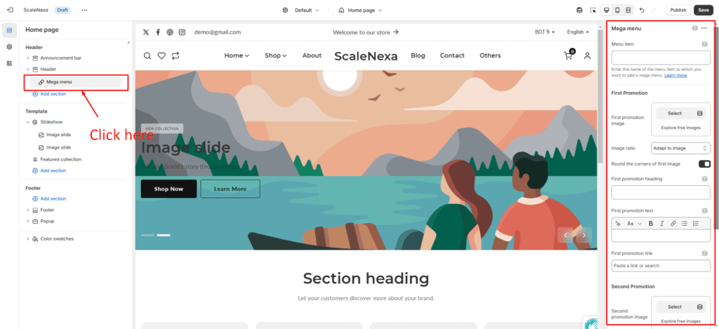
How to create a menu item #
| Settings | Description |
| Menu item | Enter the name of the menu item to which you want to add a mega menu. |
Promotion settings #
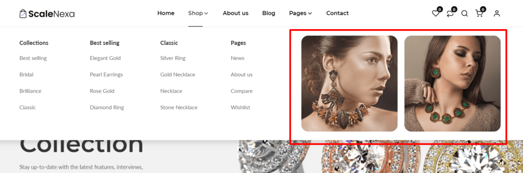
*** You have the option of uploading two images for two promotions. They all have the same settings:
| Settings | Description |
| Image | This is a setting to display an image in the mega menu as a promotion. |
| Image ratio | The image ratio for the promotion is as follows: Adapt to image(Default): The aspect ratio of the images is used. This prevents cropping of the images. Square: Images are cropped to a 1:1 aspect ratio. Portrait: Images are cropped to a 2:3 aspect ratio. Landscape: Images are cropped to a 3:2 aspect ratio. Wide: Images are cropped to a 16:9 aspect ratio. |
| Round the corners of the image | If you enable it, the promotion image corners will be round. By default, enabled it. |
| Heading | A promotion title can be displayed. If you don’t want it to be displayed, simply clear the field. |
| Text | A promotion text can be displayed. If you don’t want it to be displayed, simply clear the field. |
| Link | You can add a link to a single promotion. |