Table of Contents
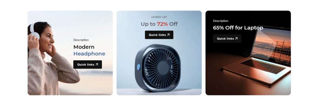
The appearance of the “Banner list” #
Section settings #
Section header
| Settings | Description |
|---|---|
| Heading | Large text for the title of the section. |
| Heading size | The size of the heading text: -Small -Medium -Large |
| Subheading | This is the section subtitle. |
| Desktop heading alignment | Left: Aligns the content to the left. Center: Aligns the content in the center. Right: Aligns the content to the right. |
| Mobile heading alignment | Left: Aligns the content to the left. Center: Aligns the content in the center. Right: Aligns the content to the right. |
Layout #
| Settings | Description |
|---|---|
| Desktop layout | Choose your preferred desktop layout from the following options: Grid: Organize your items in a structured grid format, making it easy to locate and manage your content. Mosaic: Arrange items in a preform mosaic style, allowing for a more dynamic and visually appealing display. |
| Number of columns on Desktop | Select the number of columns in the desktop view from now on. Note: This is only applicable to the Grid and Mosaic layouts. |
| Number of columns on mobile | Select the number of columns in the mobile view from now on. Note: This is only applicable to the Grid and Slider layouts. |
Banner card #
| Settings | Description |
|---|---|
| Image ratio | Shopify allows you to customize the image ratio for product images in your store. You can choose from several predefined ratios to ensure your product images are displayed optimally across different devices and layouts. Here are the available options: -Adapt to First Image -Square -Portrait -Landscape -Circle Note: It works unless you enable the “Mosaic” layout |
| Image ratio for mosaic layout | In the Mosaic layout for your Shopify store, selecting the correct image ratio is crucial for ensuring that your images are displayed in an appealing and consistent manner. Shopify provides two primary options for managing image ratios: “Adapt to image” and “Auto best-fit.” This documentation will guide you through the process of selecting and applying these settings. |
| Content position | |
| Content Space | You can change the position by following the options, – None – Small – Medium – Large |
| Content Alignment | You can change position by following the options, – Top – Middle – Bottom |
| Round Corner | Enable rounded corners for the banner image. |
| Show content below the images | Enable the display of content beneath the images. |
| Color | Color schema use for this section |
#
Banner block #
| Settings | Description |
|---|---|
| Desktop image | Choose your desktop banner image here. |
| Shopify hosted video | Choose a video from a local source. (If you use your own video, your selected image will not be applied.) |
| Mobile image | Choose your mobile banner image here. |
| Heading | Large text for the title of the section. [Text] Wrap your text between [ ] to add the color font for highlighting text color. |
| Heading size | You can change the button size Follow the options, (Large, medium, small) |
| Description | Use Description text for Banner. |
| Button size | You can change the button size Follow the options, (Large, medium, small) |
| Description | Medium text for the subtitle of the section. |
| Heading position | Top, bottom |
| Button Text | This button is for the countdown section. Leave the label blank to hide the button. |
| Button link | This is a link for the button. |
| Enable the link on the entire banner | To make the entire banner clickable, you can enable the link in the entire banner area by enabling the checkbox. |
| Button type | Primary: Use a solid background button style Secondary: Use outline button style |
| Button size | You can change the button size by following the options, (Large, medium, small) Note: Works on the primary/secondary button |
| Link button size | You can change the button size by following the options, (Large, small) Note: Works on the link button |
| Image overlay opacity | Adjust the transparency of your image overlay using an opacity range from 0% to 100% |
| Inside content padding | Choose the appropriate inside content padding size: -Extra Large -Large -Medium -Small Note: It works unless you enable the “Show content below the image” from Section general settings. |
| Override general settings | When enabled, the “General Settings” section of the “BANNER CARD” will be overridden. |
| Content position | You can change position by following the options, – Top – Middle – Bottom |
| Content Alignment | You can change alignment by following the options, – Left – Center – Right |
| Colors | Easily configure the colors for your text and buttons using the options below. |
| Mosaic grid row | It’s working on only mosaic layout – Banner column Start and end. – Banner row start and end. |
| Override the general setting | If you want to override the banner settings, you can enable this option. |
Section padding #
| Settings | |
|---|---|
| Desktop: Padding top | The section’s top inner space height is determined. From 0 to 150 px, will be incremented by 5px. It will affect the desktop. |
| Desktop: Padding bottom | The section’s bottom inner space height is determined. From 0 to 150 px, will be incremented by 5px. It will affect the desktop. |
| Mobile: Padding top | The section’s top inner space height is determined. From 0 to 150 px, will be incremented by 5px. It will affect the mobile. |
| Mobile: Padding bottom | The section’s bottom inner space height is determined. From 0 to 150 px, will be incremented by 5px. It will affect the desktop. |