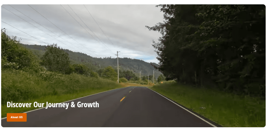
The appearance of the hero video #
Content settings #
| Settings | Description |
| Caption | This is the caption for the video section. |
| Heading | RichText: This is the heading for the lookbook section. Learn more about RichText Editor |
| Heading size | Large: This is the large text size of the section heading. Desktop size: 50px, Mobile Size: 30px Medium (Default): This is the medium text size of the section heading. Desktop size: 40px, Mobile Size: 28px Small: This is the medium text size of the section heading. Desktop size: 32px, Mobile Size: 25px |
| Button label | This is a button for a single slide. Leave the label blank to hide the button. |
| Button link | This is a link for the button. |
| Button style | Primary: Use a solid background button style Secondary: Use outline button style |
| Button size | You can change the button size follow the options, (Large, medium, small) |
| Color scheme | This is a color scheme option to change the color of the section |
Video settings #
| Settings | Description |
| URL | You can add Shopify-hosted, YouTube, and Vimeo video URLs. |
| Overlay opacity | You can add an overlay on the image from 0 to 100%. |
| Video height on desktop | Extra Small: This is the smallest height of the video. Height: 350px Small: This is the smallest height of the video. Height: 450px Medium: This is the smallest height of the video. Height: 550px Large: This is the smallest height of the video. Height: 650px Extra-Large: This is the smallest height of the video. Height: 720px |
| Desktop content position | You can change position, to follow the options: – Top – Middle – Bottom |
| Heading alignment | You can change position, to follow the options: – Left – Center – Right |
| Make section full width | You can display images and content full width in a section container. |
| Round corner | If you enable it, the section corners will be rounded. |
Section padding #
| Settings | Description |
| Desktop Padding top | The section’s top inner space height is determined. From 0 to 150 px, will be incremented by 5px. It will affect the desktop. |
| Desktop Padding bottom | The section’s bottom inner space height is determined. From 0 to 150 px, will be incremented by 5px. It will affect the desktop. |
| Mobile Padding top | The section’s top inner space height is determined. From 0 to 150 px, will be incremented by 5px. It will affect the mobile. |
| Mobile Padding bottom | The section’s bottom inner space height is determined. From 0 to 150 px, will be incremented by 5px. It will affect the desktop. |