Table of Contents
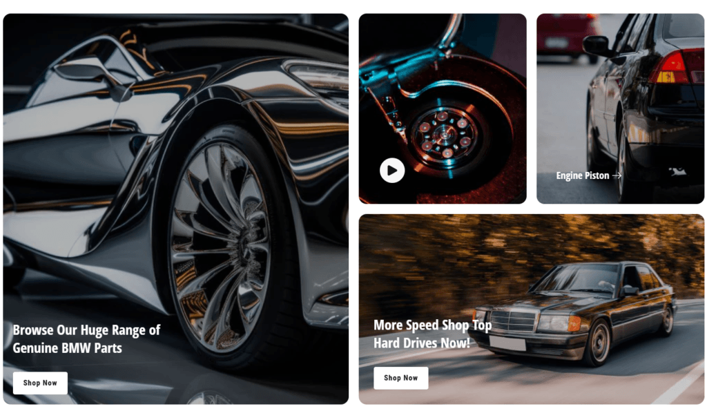
The appearance of the collage #
Section Settings #
| Settings | Description |
| Subheading | This is the section subtitle. |
| Subheading style | Select the subheading style here |
| Heading | Text: You can add a section title using the Text. |
| Heading size | Large: This is the large text size of the section heading. Desktop size: 50px, Mobile Size: 30px Medium (Default): This is the medium text size of the section heading. Desktop size: 40px, Mobile Size: 28px Small: This is the medium text size of the section heading. Desktop size: 32px, Mobile Size: 25px |
| Heading alignment | Left: Aligns the content to the left. Right: Aligns the content to the right. Center: Aligns the content to the center. |
| Heading mobile alignment | Left: Aligns the content to the left. Right: Aligns the content to the right. Center: Aligns the content to the center. |
| Grid Gap | 2rem desktop, 1rem mobile |
| Make section full width | Click on the checkbox to make the section full-width |
| Full width offset | Setup the section offset here. |
| Color scheme | Select the color scheme here. |
Grid System Overview #
| Property | Description | Range | Default |
| Column Span | Number of columns an item occupies | 1-12 | Varies by block type |
| Row Span | Number of rows an item occupies | 1-8 | Varies by block type |
Block Type Default Layouts #
| Block Type | Default Column Span | Default Row Span | Recommended Usage |
| Image | 6 | 4 | Large promotional images, hero sections |
| Product | 3 | 2 | Product showcases, featured items |
| Collection | 3 | 2 | Collection highlights, category links |
| Video | 6 | 2 | Video content, demonstrations |
Block Image #
| Settings | Description |
| Image | Select image: Click and upload your required image |
| Subheading | This is the section subtitle. |
| Subheading spacing on desktop | None: Select subheading for no spacing. Small: Select subheading spacing for 15px. Medium: Select subheading spacing for 40px. Large: Select subheading spacing for 60px. |
| Subheading Background Color | Click the checkmark to enable the subheading background color. |
| Color scheme | Select the color scheme here. |
| Heading | Text: You can add a section title using the Text. |
| Heading Size | Small: Select heading for 20px. Medium: Select heading for 24px. Large: Select heading for 32px. |
| Description | Textarea: You can add an image description using the Textarea. |
| Button label | This is a button for a single slide. Leave the label blank to hide the button. |
| Button link | This is a link for the button. |
| Button type | Primary: Use a solid background button style Secondary: Use outline button style Link Button: Without background and outline. |
| Button size | You can change the button size by following the options, (Large, medium, small) |
| Image overlay opacity | You can add an overlay on the image from 0 to 100%. |
| Content position | You can change position by following the options, – Top – Middle – Bottom |
| Content alignment | You can change alignment by following the options, – Left – Center – Right |
| Card Padding | You can change card padding by following the options, – None – Small – Medium – Large |
| Colors | – Text Color – Primary button background color – Primary button foreground color Replace with your custom colors for the subheading – Foreground color – Background color |
Product #
| Settings | Description |
| Heading | Text: You can add a section title using the Text. |
| Heading Size | Small: Select heading for 20px. Medium: Select heading for 24px. Large: Select heading for 32px. |
| Product | Select Product: Please click and select the product you would like to showcase. |
| Image ratio | Adapt to image: Uses the aspect ratio of the collection images is cropped. Portrait: uses a 2:3 cropping ratio to the images. Square: uses a 1:1 cropping ratio to the images. Landscape: Images are shown landscape. |
| Show Badge | Please click the checkmark to display sale, new, or sold-out badges. |
| Show second image on hover | Kindly click the checkmark to display the second image when hovering. |
| Color Swatch | Please select the checkmark to activate color swatches. |
| Product Ratting | Please click the checkmark to activate product rating. |
| Countdown | Kindly click the checkmark to activate the product countdown. |
| Corner Round | Please click the checkmark to round the corners of the box. |
| Color scheme for countdown | Select the color scheme here. |
Collection #
| Settings | Description |
| Heading | Text: You can add a section title using the Text. |
| Heading Size | Small: Select heading for 20px. Medium: Select heading for 24px. Large: Select heading for 32px. |
| Collection | Select Collection: Click and select product collection. |
| Image | Select image: Click and upload collection image |
| Title Design | Text, Button |
| Heading Size | – Extra small – Small – Medium – Large – Extra large |
| Button type | Primary: Use a solid background button style. Secondary: Use outline button style. |
| Button Size | You can change the button size follow the options, (Large, medium, small) |
| Card Padding | You can change card padding follow the options, – None – Small – Medium – Large |
| Button custom colors | Foreground color Background color |
Video #
| Settings | Description |
| Image | Select image: Click and upload Video image |
| Video URL | Please paste the URL of the YouTube video. |
| Video alt text | Describe the video for customers using screen readers. |
| Play button text | Text for the play button |
| Card Padding | You can change card padding follow the options, – None – Small – Medium – Large |
Mobile settings #
| Settings | Description |
| Section title alignment | Left: Aligns the content to the left. Right: Aligns the content to the right. Center: Aligns the content to the center. |
| Number of columns on mobile | You can select a product column per row following the options (1, 2). Except for the collage layout, Works on all other layouts. |
Section padding settings #
| Settings | Description |
| Desktop: Padding top | The section’s top inner space height is determined. From 0 to 150 px, will be incremented by 5px. It will affect the desktop. |
| Desktop: Padding bottom | The section’s bottom inner space height is determined. From 0 to 150 px, will be incremented by 5px. It will affect the desktop. |
| Mobile: Padding top | The section’s top inner space height is determined. From 0 to 150 px, will be incremented by 5px. It will affect the mobile. |
| Mobile: Padding bottom | The section’s bottom inner space height is determined. From 0 to 150 px, will be incremented by 5px. It will affect the desktop. |