Do you want to make sure that your Shopify website is delivering an optimal user experience on mobile? It’s easier than it sounds! In this blog post, we’ll show you exactly how to edit mobile view on Shopify in just a few simple steps. If you’re looking to give your visitors the best mobile experience possible, this is the guide for you.

Bring your ideas to life for $1/month
The future of business is yours to shape. Sign up for a free trial and enjoy 3 months of Shopify for $1/month on select plans.
Why Mobile Optimization Is Crucial
Mobile optimization is crucial for several reasons in today’s digital landscape. With the widespread use of smartphones and tablets, mobile devices have become the primary means of accessing the internet for many people. Here are some key reasons why mobile optimization is essential:
User Experience: Mobile users have different expectations and needs compared to desktop users. They want websites and apps to load quickly, be easy to navigate with touch gestures, and provide a seamless experience. Mobile optimization ensures that your website or app is designed to meet these expectations, leading to a better user experience.
Mobile Traffic Dominance: Mobile traffic has surpassed desktop traffic in many industries and regions. If your website or app is not optimized for mobile devices, you risk alienating a significant portion of your potential audience.
SEO Ranking: Search engines like Google, prioritize mobile-friendly websites in their search results. Having a mobile-optimized website can improve your search engine ranking, making it easier for users to find your content.
Decreased Bounce Rates: A poorly optimized website or app on mobile devices can result in high bounce rates, where users quickly leave your site due to slow loading times or a frustrating user experience. Mobile optimization helps reduce bounce rates and keeps users engaged with your content.
Improved Conversion Rates: Whether you’re selling products, services, or simply trying to capture leads, a mobile-optimized website or app can significantly impact your conversion rates. Users are more likely to complete actions like making a purchase or filling out a form on a mobile-friendly platform.
Recommended Blogs for You:
👉 How to Update Shopify Theme: A Step-by-Step Guide
👉 How to Reduce Bounce Rate on Shopify Store: Strategies for Engaging Visitors and Increasing Conversions
👉 How to Add a FAQ page on Shopify: A Complete Guide
👉 How to Find Your Shopify URL: An Easy Guide
👉 How to Change Address on Shopify- A Step-by-Step Guide
How to Edit Mobile View on Shopify: A Step-by-Step Guide
Here’s the step-by-step guide on how to edit mobile view on Shopify:
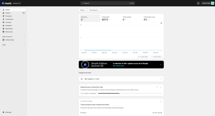
Step 1: To begin, log in to your Shopify store dashboard.
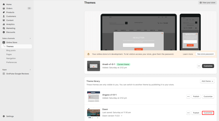
Step 2: Under the “Online Store” section, you will find the “Themes” option. Click on “Themes.”

Step 3: You will now see a list of your store’s themes. Choose the theme you want to customize and click on the “Customize” button next to it.
Step 4: In the theme customization interface, select the section you want to customize.
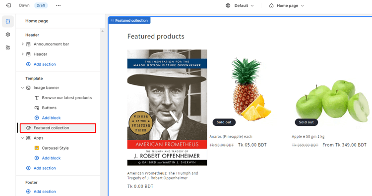
Step 5: To preview how your changes will appear on mobile devices, click on the “Mobile Preview” icon located at the top-right corner of the customization panel.

Step 6: Scroll down within the edit panel until you find the “Mobile Layout” option. Here, you can make adjustments to the selected section to optimize its appearance on mobile devices.

Step 7: Once you are satisfied with the mobile layout modifications, click on the “Save” button to save your changes.


Best Practices for Mobile-Friendly Design on Shopify
Making site mobile-friendly design for your Shopify store is essential in today’s digital landscape, where an increasing number of customers shop using smartphones and tablets. Following these guidelines will help you make sure that your Shopify store is mobile-friendly:
Responsive Design:
Choose a Shopify theme that is responsive, meaning it automatically adjusts and adapts to different screen sizes. This ensures that your website looks and functions well on various devices, from smartphones to desktop computers.
Mobile-First Approach:
Design and build your store with mobile users in mind from the start. Consider how your site will look on a small screen and prioritize mobile design elements.
Simplify Navigation:
Keep your navigation menu clean and straightforward. Use a hamburger menu (the three horizontal lines) for mobile navigation to save space. Make it easy for users to find what they’re looking for quickly.
Large, Tappable Buttons:
Design buttons and clickable elements that are large enough to tap easily with a finger. Small buttons can be frustrating for mobile users.
Optimize Images and Videos:
Compress images and use formats like WebP for faster loading times on mobile devices. Embed videos responsively to prevent them from causing display issues.
Mobile-Friendly Checkout:
Streamline the checkout process for mobile users. Implement options like guest checkout and autofill forms when possible to reduce friction.
Mobile SEO:
Implement mobile SEO best practices, including optimizing your site for mobile search and making site mobile-friendly with meta tags.
Grow Your eCommerce Business with Valuable Resources, Tools, and Lead Magnets
- Bring your ideas to life for $1/month
- One platform that lets you sell wherever your customers are—online
- Create a beautiful eCommerce website
- Start for free, then enjoy $1/month for 3 months
- Build your own website in a few steps
- Create a website in minutes easily, secure method
- Turn what you love into what you sell
- Discover the Shopify Point of Sale
- AI Based Business Name Generator
Frequently Asked Questions
How can I monitor the mobile performance of my Shopify store?
You can monitor mobile traffic, user behavior, and conversion rates with Shopify’s built-in analytics. Additionally, tools like Google Analytics can provide detailed insights into your mobile audience’s interactions.
Is mobile optimization a one-time task?
No, mobile optimization is an ongoing process. The mobile landscape continually evolves with new devices, screen sizes, and user expectations. Regularly reviewing and improving your mobile experience is essential to stay competitive and provide the best user experience.
Can Shopify provide resources or support for mobile optimization?
Yes, Shopify offers a range of resources, including mobile-friendly themes, guides, and a support team to assist with mobile optimization. Explore their documentation and reach out to their support if you need assistance.
Hire Experts to Develop Your Shopify Store (Recommended- ShopiBuffet)
Experience a transformation in your Shopify store journey with ShopiBuffet, your ultimate destination for unmatched Shopify services. ShopiBuffet offers a seamless journey, allowing you to effortlessly create a fully functional dropshipping store under the expert guidance of a proficient team.
These seasoned professionals handle every aspect, from product setup to ensuring smooth navigation, expanding sales channels, and curating exquisite collections, all while crafting captivating themes that enhance your store’s aesthetics.
However, ShopiBuffet’s services go beyond mere store setup. Their unwavering commitment extends to providing steadfast support and guidance, ensuring your triumphant presence in the digital market. Navigating the complexities of eCommerce becomes a collaborative effort with their dedicated customer assistance always at your disposal.
Bonus: Recommended Shopify Themes for Mobile Optimized Shopify Store
Mavon
Are you ready to transform your business and launch an online store that seamlessly combines functionality with eye-catching aesthetics? Meet Mavon, your ideal platform for this endeavor. Mavon offers a user-friendly experience that doesn’t necessitate any coding expertise, making it accessible to all.
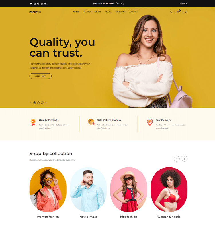
What sets Mavon apart is its commitment to transparency, with no hidden costs or recurring monthly charges. Furthermore, it’s meticulously designed for speed, ensuring that your customers enjoy swift and hassle-free shopping.
One of Mavon’s standout features is its emphasis on speed optimization, guaranteeing a responsive shopping experience that keeps customers engaged and satisfied. Additionally, Mavon empowers you to create an online store with a captivating design that not only attracts attention but also converts visitors into customers.
Moreover, Mavon provides top-tier support with a dedicated team ready to assist you whenever you need it. With a wide array of customizable sections, you have the freedom to personalize your Shopify store, ensuring it reflects your brand’s unique identity and stands out in a competitive digital landscape.
Highlighted Features:
- 20+ Flexible Sections
- Size Chart
- Lookbooks
- Color swatches
- High-resolution images
Price: Free trial version
Regular License: $280/ year
Lezada
If you are looking for a Shopify theme that will set your shop apart from the rest, then look no further than Lezada. With over 200 pre-made home versions and 11+ Revolution Sliders, creating a unique storefront has never been easier. This theme offers an abundance of customization options, including 10+ header variations, multiple blog layouts, and even an RTL version for a global audience.

Lezada is fully responsive and includes a notification bar to keep your customers informed. It also features Google Analytics integration and well-commented HTML and CSS files, making tracking progress and making adjustments a breeze. Don’t settle for a generic shop – with Lezada, you can take your storefront to the next level!
Highlighted Features:
- Fully Responsive
- RTL Version
- Notification Bar
- Multiple Currency
- Breadcrumb banner
Price: Regular License: $79
Corano
Corano is a jewelry store Shopify theme that boasts eight different homepage variations. With its updated Shopify Online Store 2.0 features, this theme is perfect for those who want to create a unique and personalized online store. One of the most impressive features of Corano is its ability to add sections to all pages, allowing for a completely customized shopping experience.

Plus, this Shopify theme offers a range of multi-color options, a newsletter popup, a notification bar, multiple currencies, and Ajax popup cart. With its MegaMenu and sidebar menu options, as well as three types of headers, Corano truly offers a comprehensive eCommerce solution for any online jewelry store.
Highlighted Features:
- MegaMenu, sidebar menu
- 3 Types Header
- Mega menu
- Slideshow
- Collection Banner
- Multiple Banner
Price: Regular License: $59
LeArts
LeArts is a complete game-changer for artisans looking to take their eCommerce storefront to the next level. With its stunning and sleek design, it will make your handmade crafts shine like never before. The theme offers a multitude of layouts, including 13+ home versions, making it a perfect fit for any artisan out there.
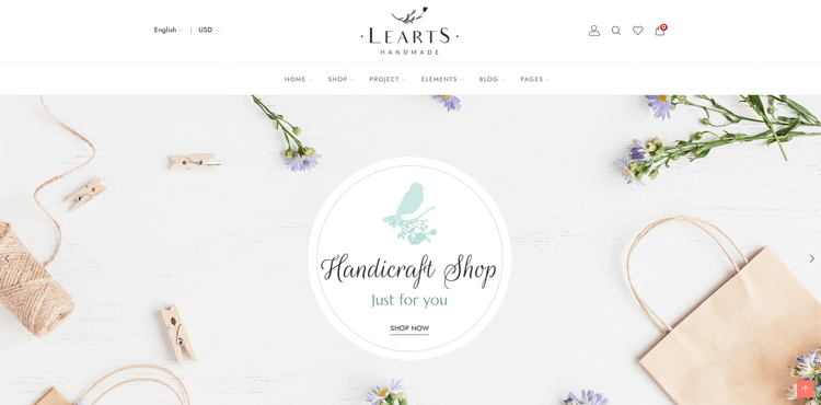
But that’s not all. With the ability to use multiple currencies, you won’t have to limit your reach and can expand to an international customer base. The deeply integrated Google Analytics and well-commented HTML & CSS files make for a hassle-free customer experience and an easy increase in profits. So, whether your art is both classic or contemporary, LeArts truly is the ideal end-to-end eCommerce solution you cannot afford to miss out on.
Highlighted Features:
- Multiple Currency
- 13+ Home Versions
- Shopify Builder
- Theme Colors
- Unlimited Colors
Price: Regular License: $49
Bring your ideas to life for $1/month
The future of business is yours to shape. Sign up for a free trial and enjoy 3 months of Shopify for $1/month on select plans.
Conclusion on
Mobile devices are becoming increasingly prevalent for online shopping, making mobile optimization a crucial aspect of any successful ecommerce site. Shopify has recognized this shift and has equipped users with the necessary tools to create a mobile-friendly user experience. By utilizing the mobile view editing options, businesses can ensure that their site is responsive and easy to navigate on any device.
Hopefully, this guide on how to edit mobile view on Shopify was helpful. With customizable options for layout and design, Shopify enables users to design their mobile site to match their brand and engage customers on smaller screens.
Overall, optimizing your mobile ecommerce experience can increase sales and customer satisfaction, making it a necessary consideration for any successful online business.